Color Charts Are Important
Creating color charts using the paints you have in your palette is such an important tool to learn your colors.
Creating a chart with a simple square of color with the name written below is a great way to keep track of all your colors. Make a little code or key of the various brands along with names of the colors.
Your own color chart is a great reference tool. Sure you can find them in many books, but having a chart of what is actually in your own palette is extremely important.
Take it a step further and create color mixing charts, check out this old Tuesday Tip:
http://ritasquier.blogspot.com/2009/02/tuesdays-tips-techniques-for-watercolor_24.html
See more color charts on my blog:
http://ritasquier.blogspot.com/search?q=color+chart
You can see the variety of colors you have at a glance.
Creative Ramblings by Artist Rita Squier
Watercolor Artist • Art Director & Creative Genius
Tuesday, April 16, 2013
Monday, April 15, 2013
The Artist's Onion
My First Onion
by Artist Rita Squier
Original Watercolor Painting
5x7 inches
Sometime last week, after seeing someone post a photo of onions growing in a garden I had said the onion is a popular subject for artists. His reply was something like Let's paint onions this weekend. A challenge!
I had never painted an onion in watercolor or in any medium.
It brought back a memory from years ago. I had typeset a lady's memoirs in which she had written about how many artists loved to paint onions and it was something just about every artist did. She also had written about how artists loved to attempt to paint Pierre Auguste Renoir's Onions.
(This is a little iPod photo that I may just have to take a better photo tomorrow afternoon.)
by Artist Rita Squier
Original Watercolor Painting
5x7 inches
Sometime last week, after seeing someone post a photo of onions growing in a garden I had said the onion is a popular subject for artists. His reply was something like Let's paint onions this weekend. A challenge!
I had never painted an onion in watercolor or in any medium.
It brought back a memory from years ago. I had typeset a lady's memoirs in which she had written about how many artists loved to paint onions and it was something just about every artist did. She also had written about how artists loved to attempt to paint Pierre Auguste Renoir's Onions.
(This is a little iPod photo that I may just have to take a better photo tomorrow afternoon.)
Tuesday, April 9, 2013
Tuesday's Tips and Techniques for Watercolor Painting
Paper Quality
I cannot stress enough how important paper quality is when it comes to watercolor painting.
Here is a recent sample color chart I created.
The large piece of paper is Saunders Waterford 100% Cotton Rag, Archival, Acid Free, 140 lb. watercolor paper. It is awesome!
The little strip of colors contains the same exact high quality MaimeriBlu watercolor paints as in the far left column of the larger sheet. Notice the colors are not as rich and dark.
The little narrow strip of paper is a synthetic watercolor paper. It has the texture and feel of watercolor paper but it does not react like 100% cotton rag. It does something odd to the paint.
If you're just learning to paint, stick with the good stuff, it will make the learning process more enjoyable. Inferior and cheap paper & paints will only frustrate you as you are trying to learn techniques.
I cannot stress enough how important paper quality is when it comes to watercolor painting.
Here is a recent sample color chart I created.
The large piece of paper is Saunders Waterford 100% Cotton Rag, Archival, Acid Free, 140 lb. watercolor paper. It is awesome!
The little strip of colors contains the same exact high quality MaimeriBlu watercolor paints as in the far left column of the larger sheet. Notice the colors are not as rich and dark.
The little narrow strip of paper is a synthetic watercolor paper. It has the texture and feel of watercolor paper but it does not react like 100% cotton rag. It does something odd to the paint.
If you're just learning to paint, stick with the good stuff, it will make the learning process more enjoyable. Inferior and cheap paper & paints will only frustrate you as you are trying to learn techniques.
Monday, April 8, 2013
Paper Testing
Dew Drops on Garza Papel
by Artist Rita Squier
Original Watercolor Painting
Size: 14 x 20 cm
Several months ago, perhaps last Autumn, I received a few sample sheets of Garza Papel Artisan Paper made in Spain. As soon as I got the paper I created one small landscape and this swashy blue background in my own style of painting to see how the paper reacts.
This is 100% recycled cotton, acid free, watercolor paper and the weight is 300 grs. The paper has a great white tone. It has a very nice soft feel and texture to the paper and it accepts the paint extremely well. I even like the little embossed heron in the lower left corner.
It has been months since I painted the background. Just the other day, I decided I would test out my dew drops. Lifting color on this paper even after months worked effortlessly.
I am very impressed with this 100% cotton recycled paper!
Thank you Garza Papel!
by Artist Rita Squier
Original Watercolor Painting
Size: 14 x 20 cm
Several months ago, perhaps last Autumn, I received a few sample sheets of Garza Papel Artisan Paper made in Spain. As soon as I got the paper I created one small landscape and this swashy blue background in my own style of painting to see how the paper reacts.
This is 100% recycled cotton, acid free, watercolor paper and the weight is 300 grs. The paper has a great white tone. It has a very nice soft feel and texture to the paper and it accepts the paint extremely well. I even like the little embossed heron in the lower left corner.
It has been months since I painted the background. Just the other day, I decided I would test out my dew drops. Lifting color on this paper even after months worked effortlessly.
I am very impressed with this 100% cotton recycled paper!
Thank you Garza Papel!
Friday, April 5, 2013
I am Back
Forest Fog II (vertical on the left)
Forest Fog (horizontal on the right)
by Artist Rita Squier
Original Watercolor Paintings
Size: 2.5 x 3.5 inches
Tons of stuff has kept me busy, preoccupied, etc. over the past few months and it left me with very little time and ambition to blog. I've realized I have missed blogging. I have just started regularly painting again as well.
I have decided to use the little calendar app and actually schedule in some painting time each day, Monday to Friday. Being able to paint on the weekends will be a bonus! And it will also be unscheduled fun.
To start off my painting time yesterday, these are two little ACEOs I created.
ACEO = Art Cards, Editions & Originals - These are original watercolors!
Forest Fog (horizontal on the right)
by Artist Rita Squier
Original Watercolor Paintings
Size: 2.5 x 3.5 inches
Tons of stuff has kept me busy, preoccupied, etc. over the past few months and it left me with very little time and ambition to blog. I've realized I have missed blogging. I have just started regularly painting again as well.
I have decided to use the little calendar app and actually schedule in some painting time each day, Monday to Friday. Being able to paint on the weekends will be a bonus! And it will also be unscheduled fun.
To start off my painting time yesterday, these are two little ACEOs I created.
ACEO = Art Cards, Editions & Originals - These are original watercolors!
Tuesday, February 26, 2013
Tuesday Tips & Techniques for Watercolor Painting
Work Vertical
Have you ever tried working vertical while creating a watercolor painting?
It's not impossible.
If it scares you, go for the abstract look to try it out.
Tape your watercolor to a board, prop it up on an easel and paint away with no worries or cares!
Work wet into wet.
Splatter on some color.
Spray on a bit of water.
Yes, the colors will drip and blend one into another.
Give it a try, you may be pleased with the results.
Normally, watercolor is painted on a flat surface or a slightly tilted surface, working vertically with the board literally straight up and down can be a challenge. The reason being, you're working with water and it drips. I have done several vertical abstracts that have turned out really well. I love them.
I have been thinking of trying a more detailed landscape or maybe buildings will working vertically. Could be fun. Could have a very interesting and unique look.
If you have given it a try ... I want to see your results!
Wednesday, February 20, 2013
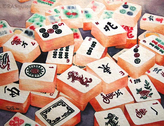
For the Love of Mah Jongg
Mahjong Tiles
by Artist Rita A. Squier
This is the second painting in my Mahjong Series!
It is currently available in my Squier Etsy shop as an ACEO print. A fine art giclee print.
Mahjong, Mah Jong, Mah Jongg ... I love this game!
Hope you love the prints of my new watercolor.
Soon it will be available as 5x7, 8x10 and 9x12 prints. And post cards too!
Can't wait for the post cards to come back from the printers.
by Artist Rita A. Squier
This is the second painting in my Mahjong Series!
It is currently available in my Squier Etsy shop as an ACEO print. A fine art giclee print.
Mahjong, Mah Jong, Mah Jongg ... I love this game!
Hope you love the prints of my new watercolor.
Soon it will be available as 5x7, 8x10 and 9x12 prints. And post cards too!
Can't wait for the post cards to come back from the printers.
Saturday, February 2, 2013
Mahjong Postcard
I have had my Mahjong 2013 watercolor painting turned into postcards. I love it!
I will be soon be selling them through my own website and a few are currently available in my Squier Etsy shop.
These are awesome!
Excellent quality.
I would love to wholesale both my postcards & prints, if you're interested, contact me. Thanks.
I will be soon be selling them through my own website and a few are currently available in my Squier Etsy shop.
These are awesome!
Excellent quality.
I would love to wholesale both my postcards & prints, if you're interested, contact me. Thanks.
Tuesday, January 29, 2013
Tuesday Tips and Techniques for Watercolor Painting
Fingerprints!
Be extremely careful on how you handle your watercolor paper. Make sure your hands are clean and dry.
Oily fingers, sweaty hands, recently applied hand lotion, cold clammy fingers can all leave fingerprints on your watercolor paper. And guess what? They often don't show up until the paint is almost dry.
This is a great tip, especially for this time of year when the air is dry and you need hand lotion.
I have notice with hand lotion, the color seems to be attracted to it and the fingerprints dry darker. The natural oils in your hands or the oils from those chips you're snacking on can cause a resist and leave the finger print area paler.
Saturday, January 26, 2013
Millefiori Clay Pen
I have been wanting a fountain pen for quite some time now. I decided that was going to be my birthday present to myself. After doing a little research and putting some thought into it, I chose to make my own pen.
I ordered millefiori clay canes on Etsy. I purchased a fountain pen kit that was meant for woodworking projects. The kit even included a cartridge of black ink, which I chose not use. I purchased some blue ink cartridges. Instead of turning wood for the outside, which I have no clue on how to do or the equipment to do it, I covered the pen with clay.
A little slicing, sticking, rolling, baking, assembly and voila ... a pen!
Love it!
Tuesday, January 22, 2013
Tuesday Tips and Techniques for Watercolor Painting
Lost and Found Background
In the past I have talked about lost and found edges, hard and soft edges.
This technique can help you create a very unique and interesting background to your watercolor paintings.
A recent Tuesday Tip from a few months back explains the how to:
http://ritasquier.blogspot.com/2012/10/tuesdays-tips-and-techniques-for.html
Apple Blossoms
by Artist Rita A. Squier
Original Watercolor Painting
11 x 15 inches
Tuesday, January 15, 2013
Tuesday Tips and Techniques for Watercolor Painting
Splatter Away!
Have you tried the splatter technique?
Wet your brush, swash it around in some watercolor paint, then tap the wooden part of the brush against the wooden part of another brush held firmly in your other hand and let the paint splatter onto your paper.
You can tap one brush against another brush, a ruler, a pencil or something firmly held in your other hand. It's just likely clanking two sticks together.
Practice over a test sheet of paper. Tap onto dry paper. Tap onto wet sections. Tap one color into another. Vary the amount of paint and water you have in your brush. Try different sized brushes. A round brush versus a flat brush.
Before you know it, you'll have a neat abstract painting!
Have you tried the splatter technique?
Wet your brush, swash it around in some watercolor paint, then tap the wooden part of the brush against the wooden part of another brush held firmly in your other hand and let the paint splatter onto your paper.
You can tap one brush against another brush, a ruler, a pencil or something firmly held in your other hand. It's just likely clanking two sticks together.
Practice over a test sheet of paper. Tap onto dry paper. Tap onto wet sections. Tap one color into another. Vary the amount of paint and water you have in your brush. Try different sized brushes. A round brush versus a flat brush.
Before you know it, you'll have a neat abstract painting!
Friday, January 11, 2013
Mahjong Obsession
Mahjong 2013
Fine Art Giclee Prints
by Artist Rita A. Squier
Last summer, I learned to play Mah Jongg at the local library. I became obsessed with the game! I love to play Mah Jongg.
I did my research, picked out the perfect new set for myself. Occasionally, I still love researching vintage sets. The engravings are amazing.
This brings me to my newest watercolor painting series which I am thinking of calling the entire series of paintings Mahjong Obsession. Painting one and two in the new series are complete.
My first watercolor painting in the series has been turned into prints! I received the box of prints last night and finally found time to open the package this afternoon. The prints are amazing! I am so happy with them.
Mahjong 2013 is the first print in the series. If you're interested in purchasing a print, please contact me. I have them currently available as 5x7 and 9x12 inch prints.
They're printed on Somerset Velvet paper with a one inch border all around. The 5x7 print is on 7x9 paper and it is perfect for matting and framing with an 8x10 inch frame. The 9x12 print is on 11x14 paper perfect for matting and framing with a standard 11x14 frame.
Soon they will be available on my website or in my Etsy shop. If you can't wait, contact me!
Mahjong 2013 - Giclee Fine Art Print 5x7 inch
Tuesday, January 8, 2013
Tuesday Tips and Techniques for Watercolor Painting
Too Many Brushes?
I would say this is not even half the watercolor painting brushes I own. These are the ones that sit on my art table. Okay, so I stuffed them all into one cup for the photo.
When learning to paint in watercolor and being successful at it ... less is more when it comes to brushes.
Select a few brushes.
Concentrate on learning how to use those few brushes and use them really well.
It's easier to practice techniques with the same brush over and over and over than to figure out how to create it with a dozen different sized round brushes.
Five brushes. One small round, one medium round, one large round. A 3/4 inch one stroke flat brush and a 1 1/2 inch wash brush. Those are the basics.
I would say this is not even half the watercolor painting brushes I own. These are the ones that sit on my art table. Okay, so I stuffed them all into one cup for the photo.
When learning to paint in watercolor and being successful at it ... less is more when it comes to brushes.
Select a few brushes.
Concentrate on learning how to use those few brushes and use them really well.
It's easier to practice techniques with the same brush over and over and over than to figure out how to create it with a dozen different sized round brushes.
Five brushes. One small round, one medium round, one large round. A 3/4 inch one stroke flat brush and a 1 1/2 inch wash brush. Those are the basics.
Friday, January 4, 2013
Tuesday, January 1, 2013
Wednesday, December 19, 2012
Twitter Art Exhibit Los Angeles
Dew Drop Trio
by Artist Rita Squier
Original Watercolor Painting
Size: 4x6 inches
This is my entry into the next Twitter Art Exhibit!
The Twitter Art Exhibit: Los Angeles
Exhale Unlimited Gallery
953 Chung King Road
Los Angeles, CA
January 12 through February 10, 2013
For more information: http://twitterartexhibit.org
If you are an artist on Twitter, check out the Call For Artists:
http://twitterartexhibit.org/callforartists
Deadline for Submission is Friday, January 4, 2013
Post Card Sized Paintings will be for sale for $35.00
The charity the sale of the paintings will benefit is Art Division in LA's Rampart District, an at-risk group within one of Los Angeles' most densely populate and underserved communities.
by Artist Rita Squier
Original Watercolor Painting
Size: 4x6 inches
This is my entry into the next Twitter Art Exhibit!
The Twitter Art Exhibit: Los Angeles
Exhale Unlimited Gallery
953 Chung King Road
Los Angeles, CA
January 12 through February 10, 2013
For more information: http://twitterartexhibit.org
If you are an artist on Twitter, check out the Call For Artists:
http://twitterartexhibit.org/callforartists
Deadline for Submission is Friday, January 4, 2013
Post Card Sized Paintings will be for sale for $35.00
The charity the sale of the paintings will benefit is Art Division in LA's Rampart District, an at-risk group within one of Los Angeles' most densely populate and underserved communities.
Tuesday, December 18, 2012
Tuesday's Tips and Techniques for Watercolor Painting
The Old Palette
Dig out that old watercolor palette. Maybe there is a color waiting there that you have not used in a very long time. Perhaps it will become your new favorite old color.
Here is a picture of a palette I have not used in a few years. Permanent Violet Bluish is a color that I have had in all my palettes since ummm 1998. This palette is not that old though, I think I put it together in the early 2000s. The turn of the current century!
MaimeriBlu's Avignon Orange, Dragon's Blood and Garnet Lake. I love these colors! These are three colors I chose based solely on their names. Yes, I am guilty of this. It's gotta a cool name and I want to try it. Garnet because it's my birthstone. Dragon's Blood, it's a mythical magical color. I will be incorporating these colors in upcoming projects.
What colors are on your old watercolor palette?
Dig out that old watercolor palette. Maybe there is a color waiting there that you have not used in a very long time. Perhaps it will become your new favorite old color.
Here is a picture of a palette I have not used in a few years. Permanent Violet Bluish is a color that I have had in all my palettes since ummm 1998. This palette is not that old though, I think I put it together in the early 2000s. The turn of the current century!
MaimeriBlu's Avignon Orange, Dragon's Blood and Garnet Lake. I love these colors! These are three colors I chose based solely on their names. Yes, I am guilty of this. It's gotta a cool name and I want to try it. Garnet because it's my birthstone. Dragon's Blood, it's a mythical magical color. I will be incorporating these colors in upcoming projects.
What colors are on your old watercolor palette?
Tuesday, December 11, 2012
Tuesday's Tips and Techniques for Watercolor Painting
Take Notes!
It is an excellent idea to take notes of the colors your are using in a watercolor painting.
This is a great thing to practice if you are new to watercolor painting. It will help you remember your colors and color mixtures. You can always refer back to your notes in the future if you want to know "How did I mix that color?"
If you are working on a project that will take more than a few days, having color notes to reference over a period of time is very helpful. Especially if you have several reds or blues that look the same in the palette but paint very differently on paper.
Paint a swash of color and write down the name of the color. If you have that color in more than one brand, remember to add the brand to your notes. If you're mixing two colors together, make note of the two colors you mixed to achieve that color.
I love to take notes and I save them for future reference.
It is an excellent idea to take notes of the colors your are using in a watercolor painting.
This is a great thing to practice if you are new to watercolor painting. It will help you remember your colors and color mixtures. You can always refer back to your notes in the future if you want to know "How did I mix that color?"
If you are working on a project that will take more than a few days, having color notes to reference over a period of time is very helpful. Especially if you have several reds or blues that look the same in the palette but paint very differently on paper.
Paint a swash of color and write down the name of the color. If you have that color in more than one brand, remember to add the brand to your notes. If you're mixing two colors together, make note of the two colors you mixed to achieve that color.
I love to take notes and I save them for future reference.
Wednesday, December 5, 2012
Christmas Ornaments
It is so much fun creating Christmas ornaments from my hand tipped, torch fired enamel beads. The large 20 mm balls are perfect for miniature Christmas Ornaments.
I have been busy adding more ornaments to the Christmas Ornament Section my Squier Etsy Shop.
Tuesday, December 4, 2012
Tuesday's Tips and Techniques for Watercolor Painting
My favorite mixture for creating the perfect color for rocks with watercolor is burnt sienna and ultramarine blue.
Mix the two color equally and deeply and you can achieve a rich black, water it down a bit for the perfect neutral grey.
Add more burnt sienna if you want browner rocks.
Add more ultramarine blue if you want a blue grey rock.
Both burnt sienna and ultramarine blue are sedimentary colors. They have heavy pigments that will sink at different rates within the water. You can achieve neat sedimentary or granulating effects for rocks by mixing these two colors together. It creates a cool textured effect.
I love this combo!
Mix the two color equally and deeply and you can achieve a rich black, water it down a bit for the perfect neutral grey.
Add more burnt sienna if you want browner rocks.
Add more ultramarine blue if you want a blue grey rock.
Both burnt sienna and ultramarine blue are sedimentary colors. They have heavy pigments that will sink at different rates within the water. You can achieve neat sedimentary or granulating effects for rocks by mixing these two colors together. It creates a cool textured effect.
I love this combo!
Subscribe to:
Posts (Atom)