Blow Dry Your Watercolors
Impatiently waiting to get onto the next step of your watercolor painting?
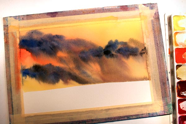
You can use a hair dryer to blow dry your watercolor painting.
If you're not waiting for the paint to react on it's own or with other colors to create a cool effect then yes it is okay to use a blow dryer to dry the paint and water.
Creative Ramblings by Artist Rita Squier
Watercolor Artist • Art Director & Creative Genius
Showing posts with label rita squier. Show all posts
Tuesday, May 7, 2013
Friday, May 3, 2013
Watercolor in 5x7
Forest Clearing
by Artist Rita Squier
Original Watercolor Painting
Size: 5x7 inches
140 lb. Lana Aquarelle Paper
MaimeriBlu Watercolor Paint
An early Spring watercolor landscape.
Available in my Etsy Shop.
Tuesday, April 23, 2013
Tuesday's Tips and Techniques for Watercolor Painting
Watercolor Blocks
Your style of painting should be a factor in deciding whether to purchase and paint on watercolor blocks of paper.
They are fantastic in some ways. They are a sturdy block on which to paint. Ten to twenty sheets of cut to size paper is pre-mounted on a sturdy backer. Paint on the top piece of paper, slice the gum around the edges remove it and paint again. Great for a not so wet way of painting with watercolors.
If you are one who loves to paint very wet with watercolor, a block of watercolor paper may not be a good option for you.
Painting wet into wet, over and over the water seeps down through the paper into the block, into the next sheet down and the sheet down below that one. The gum edges begin to wear away without notice, the water will drip over the sides and seep into the edges of the watercolor paper.
The watercolor paper that is wet and dried over and over will lose it's sizing. Your paint will not react in the normal way over the entire piece of paper. You may end up with a mottled look around the edges, often darker than color should be. Sometimes it can occur through out the entire piece of paper. It mainly happens with the pieces of paper that are towards the bottom of the block.
The sample here shows a very pale blue sky wash that normally floats on the top of the paper. The watercolor paint soaked oddly into the paper around the edges. The majority of the time, this odd effect does not fade away when the paint dries.
To avoid this happening, I remove one sheet watercolor paper from the block and mount it onto a separate board. Yes, it defeats the purpose of using a block. But it is a way to use up the block you have. Or it is a way of using the pre cut to size paper blocks with the beautiful simplicity of painting watercolors very wet into wet.
Tuesday, April 16, 2013
Tuesday's Tips and Techniques for Watercolor Painting
Color Charts Are Important
Creating color charts using the paints you have in your palette is such an important tool to learn your colors.
Creating a chart with a simple square of color with the name written below is a great way to keep track of all your colors. Make a little code or key of the various brands along with names of the colors.
Your own color chart is a great reference tool. Sure you can find them in many books, but having a chart of what is actually in your own palette is extremely important.
Take it a step further and create color mixing charts, check out this old Tuesday Tip:
http://ritasquier.blogspot.com/2009/02/tuesdays-tips-techniques-for-watercolor_24.html
See more color charts on my blog:
http://ritasquier.blogspot.com/search?q=color+chart
You can see the variety of colors you have at a glance.
Creating color charts using the paints you have in your palette is such an important tool to learn your colors.
Creating a chart with a simple square of color with the name written below is a great way to keep track of all your colors. Make a little code or key of the various brands along with names of the colors.
Your own color chart is a great reference tool. Sure you can find them in many books, but having a chart of what is actually in your own palette is extremely important.
Take it a step further and create color mixing charts, check out this old Tuesday Tip:
http://ritasquier.blogspot.com/2009/02/tuesdays-tips-techniques-for-watercolor_24.html
See more color charts on my blog:
http://ritasquier.blogspot.com/search?q=color+chart
You can see the variety of colors you have at a glance.
Monday, April 8, 2013
Paper Testing
Dew Drops on Garza Papel
by Artist Rita Squier
Original Watercolor Painting
Size: 14 x 20 cm
Several months ago, perhaps last Autumn, I received a few sample sheets of Garza Papel Artisan Paper made in Spain. As soon as I got the paper I created one small landscape and this swashy blue background in my own style of painting to see how the paper reacts.
This is 100% recycled cotton, acid free, watercolor paper and the weight is 300 grs. The paper has a great white tone. It has a very nice soft feel and texture to the paper and it accepts the paint extremely well. I even like the little embossed heron in the lower left corner.
It has been months since I painted the background. Just the other day, I decided I would test out my dew drops. Lifting color on this paper even after months worked effortlessly.
I am very impressed with this 100% cotton recycled paper!
Thank you Garza Papel!
by Artist Rita Squier
Original Watercolor Painting
Size: 14 x 20 cm
Several months ago, perhaps last Autumn, I received a few sample sheets of Garza Papel Artisan Paper made in Spain. As soon as I got the paper I created one small landscape and this swashy blue background in my own style of painting to see how the paper reacts.
This is 100% recycled cotton, acid free, watercolor paper and the weight is 300 grs. The paper has a great white tone. It has a very nice soft feel and texture to the paper and it accepts the paint extremely well. I even like the little embossed heron in the lower left corner.
It has been months since I painted the background. Just the other day, I decided I would test out my dew drops. Lifting color on this paper even after months worked effortlessly.
I am very impressed with this 100% cotton recycled paper!
Thank you Garza Papel!
Tuesday, January 22, 2013
Tuesday Tips and Techniques for Watercolor Painting
Lost and Found Background
In the past I have talked about lost and found edges, hard and soft edges.
This technique can help you create a very unique and interesting background to your watercolor paintings.
A recent Tuesday Tip from a few months back explains the how to:
http://ritasquier.blogspot.com/2012/10/tuesdays-tips-and-techniques-for.html
Apple Blossoms
by Artist Rita A. Squier
Original Watercolor Painting
11 x 15 inches
Tuesday, December 4, 2012
Tuesday's Tips and Techniques for Watercolor Painting
My favorite mixture for creating the perfect color for rocks with watercolor is burnt sienna and ultramarine blue.
Mix the two color equally and deeply and you can achieve a rich black, water it down a bit for the perfect neutral grey.
Add more burnt sienna if you want browner rocks.
Add more ultramarine blue if you want a blue grey rock.
Both burnt sienna and ultramarine blue are sedimentary colors. They have heavy pigments that will sink at different rates within the water. You can achieve neat sedimentary or granulating effects for rocks by mixing these two colors together. It creates a cool textured effect.
I love this combo!
Mix the two color equally and deeply and you can achieve a rich black, water it down a bit for the perfect neutral grey.
Add more burnt sienna if you want browner rocks.
Add more ultramarine blue if you want a blue grey rock.
Both burnt sienna and ultramarine blue are sedimentary colors. They have heavy pigments that will sink at different rates within the water. You can achieve neat sedimentary or granulating effects for rocks by mixing these two colors together. It creates a cool textured effect.
I love this combo!
Tuesday, November 27, 2012
Tuesday's Tips and Techniques for Watercolor Painting
Wet Your Brush First
A super important thing to remember when watercolor painting is to always always wet your brush in clean water first before dipping the brush into the paint.
Wetting the brush first will help your brushes last longer.
This is super important if you have the very nice and very expensive sable brushes.
Wet the brush first, even if you have a puddle of color on your palette.
A super important thing to remember when watercolor painting is to always always wet your brush in clean water first before dipping the brush into the paint.
Wetting the brush first will help your brushes last longer.
This is super important if you have the very nice and very expensive sable brushes.
Wet the brush first, even if you have a puddle of color on your palette.
Tuesday, November 20, 2012
Tuesday's Tips and Techniques for Watercolor Painting
Twist Drag and Roll
Need to form a point with your round brush to paint a nice fine line?
Dip your brush into your color.
Twist, Drag and Roll the brush backwards across your palette to get the brush back into its pointy shape.
Paint your line.
Need to form a point with your round brush to paint a nice fine line?
Dip your brush into your color.
Twist, Drag and Roll the brush backwards across your palette to get the brush back into its pointy shape.
Paint your line.
Tuesday, November 13, 2012
Tuesday's Tips and Techniques for Watercolor Painting
Pale Pale Wash
Have trouble seeing where you put the clear water when creating a wet into wet background?
Use a super pale pale color when creating your background or sky to dampen the paper before adding in your colors. This way you can see where you have painted already painted the wash and where you need to go.
The super pale color will dry back and almost disappear when dry and you will have a guide as to where to place your wet into wet colors.
Have trouble seeing where you put the clear water when creating a wet into wet background?
Use a super pale pale color when creating your background or sky to dampen the paper before adding in your colors. This way you can see where you have painted already painted the wash and where you need to go.
The super pale color will dry back and almost disappear when dry and you will have a guide as to where to place your wet into wet colors.
Tuesday, October 23, 2012
Tuesday's Tips and Techniques for Watercolor Painting
Crossing Planes
Adding an object that crosses from one plane over top of another will add depth to your painting.
The tall grasses crossover the pond, this helps to add depth.
The tree on the left, crosses over the middle ground and background adding even more depth and interest to the painting.
This is a simple trick to add depth to your watercolor painting.
Plus the tree relates to last week's tip, its branches extend beyond the top and side of the painting.
Monday, October 22, 2012
Colorful Color
The Little House
by Artist Rita Squier
Original Watercolor Painting
Size: 11x15"
Saunders Waterford 140 lb. Watercolor Paper
MaimeriBlu Watercolor Paint
Last week's class project. And what a fun and colorful project it was!
Saturday, October 6, 2012
Saturday's Painting
October Birthday
by Artist Rita Squier
Original Watercolor Painting
Size: 7" x 10"
On 300 lb. Winsor Newton Watercolor Paper
Painted this afternoon. I have not painted on 300 lb. paper in awhile, I do enjoy it. I actually love it! The ability to paint wet into wet for a longer period of time suits my style perfectly.
Those with October birthdays get to enjoy the splendor and beauty of Autumn's colorful display.
Tuesday, September 25, 2012
Tuesday's Tips and Techniques for Watercolor Painting

Tilt the Board
Tilting wet into wet watercolor can create drama and cool effects in your paintings.
1. Apply strong colors wet into wet.
2. Tip your board at a steep angle, allowing the colors to flow and blend. For this one I tipped the board almost vertical and angled it resting the right bottom corner on my table. I used a paper towel to blot and paint & water that ran off the edge of the paper.
3. Once your are satisfied with the movement of the paint. Lay the painting flat to dry.
This is an excellent way to create a dramatic sky in your paintings.
Think driving rain storm.
Friday, July 20, 2012
More Beads
More of my torch fired enamel beads. A variety of beautiful colors for the 18 mm loopy beads and the 14x16 mm woven beads.
I love coating the metal beads with glass enamel using a small torch. The spinning of the bead, the choosing of colors, watching the colors blend, it's almost therapeutic.
Sometimes the color combinations are a complete surprise. The nature of the torch, the variation of heat on where you place the bead in the flame, the mixing of colors, timing, so many variables.
You just have to wait until the bead cools to see what you got!
Tuesday, July 17, 2012
Tuesday's Tips and Techniques for Watercolor Painting
Misting Your Palette
Depending on the brand of watercolor paint you're using, the time of year, the location or the age of your palette it may be necessary to mist your palette with clean clear water before you begin painting. This will help soften the paint and make it easier for you to pick up more color, more quickly.
This is my very first palette of watercolors. I started painting in watercolors in 1995. All but two colors are Winsor Newton watercolors and they are the colors suggested by my first instructor. The two additions Sap Green and Permanent Violet Bluish are Maimeri Blu watercolors.
The Winsor Newton colors consist of Paynes Grey, Brown Madder, Burnt Sienna, Alizarin Crimson, Cerulean Blue, French Ultramarine, Hookers Green, Yellow Ochre, Cadmium Yellow, Cadmium Orange and Sepia. Many of the colors have been replaced over time. However, the cadmium yellow and cadmium orange I know for a fact I have only purchased one tube of each of those. A little spritz of water before I begin painting and the paint works perfectly, like a charm. Yes, you can use that old watercolor paint palette!
Depending on the brand of watercolor paint you're using, the time of year, the location or the age of your palette it may be necessary to mist your palette with clean clear water before you begin painting. This will help soften the paint and make it easier for you to pick up more color, more quickly.
This is my very first palette of watercolors. I started painting in watercolors in 1995. All but two colors are Winsor Newton watercolors and they are the colors suggested by my first instructor. The two additions Sap Green and Permanent Violet Bluish are Maimeri Blu watercolors.
The Winsor Newton colors consist of Paynes Grey, Brown Madder, Burnt Sienna, Alizarin Crimson, Cerulean Blue, French Ultramarine, Hookers Green, Yellow Ochre, Cadmium Yellow, Cadmium Orange and Sepia. Many of the colors have been replaced over time. However, the cadmium yellow and cadmium orange I know for a fact I have only purchased one tube of each of those. A little spritz of water before I begin painting and the paint works perfectly, like a charm. Yes, you can use that old watercolor paint palette!
Tuesday, April 24, 2012
Tuesday's Tips and Techniques for Watercolor Painting
Wet into Water
You may have tried wet into wet watercolor painting, how about trying wet into water?
You can get some really cool effects using this technique.
- Paint a shape with clean, clear water.
- Using rich, creamy, strong color, float the color around the edges of your shape.
- Leave it alone.
- Let it dry without touching it.
Depending how much water and how much pigment you use, you can create some really cool effects. If you float in pigment into a very wet puddle, you will get more interesting effects. The pigment and water will begin to dry at different rates. If you DO NOT touch it, it will change as it dries. Allow the water and pigment to do it's thing without fiddling with it.
If you float a more watery mix of pigment into your clear water shape, you will get more of an even tone once it is dry. Less dramatic effects.
Notice the difference between the left and right squares.
The 4th photo in the bottom right corner is completely dry.
Give it a try and let me know how you did!
Wednesday, April 4, 2012
Sneak Peak
Wednesday, March 21, 2012
My Nook Book Cover

I created my very own Nook book cover. I am so happy and excited with my result.
I took a pretty journal and turned it into a secret book safe for my Nook. Choosing just the right size journal, height, width and depth was key.
I had a little help from my darling husband, who used a jig saw to remove the innards of the book. The rest I did myself. Planning, gluing, painting, cutting.
I even created the abstract watercolor used through out the inside. See your watercolor painting skills can come in handy for all sorts of projects!
Tuesday, March 20, 2012
Tuesday's Tips and Techniques for Watercolor Painting

Label Your Watercolor Palette
It is an excellent idea to label the side of your watercolor palette with the names of the colors you have in your palette.
Use an Ultra Thin Sharpie for handwriting the color names or use a label maker.
If you have the name there you can easily glance at it to see which yellow or which blue you are using. Or if you have used it up and have thrown away the tube, you will have the name there so you know which color you need to re-order.
Here's an extra tip: Use a damp Mr. Clean Eraser to clean off the old name before writing the new name or re-writing a faded or worn off name.
Subscribe to:
Posts (Atom)