Showing posts with label tuesday. Show all posts

Tuesday, September 25, 2012

Tuesday's Tips and Techniques for Watercolor Painting


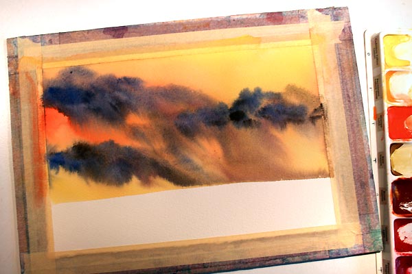
Tilt the Board 

Tilting wet into wet watercolor can create drama and cool effects in your paintings.

1. Apply strong colors wet into wet.
2. Tip your board at a steep angle, allowing the colors to flow and blend.  For this one I tipped the board almost vertical and angled it resting the right bottom corner on my table.  I used a paper towel to blot and paint & water that ran off the edge of the paper.
3.  Once your are satisfied with the movement of the paint.  Lay the painting flat to dry.

This is an excellent way to create a dramatic sky in your paintings.

Think driving rain storm.


Tuesday, July 5, 2011

Tuesday's Tips and Techniques for Watercolor Painting

The Pitt Pen

For my pen and ink watercolors, I always use a Faber Castell's Pitt Artist Pen. It is an india ink pen which is also waterproof.

Waterproof is important when drawing with ink and then painting in watercolor over the top. If your ink is not waterproof when dry it will bleed and look messy.

The Pitt Pens can be purchased as a set or purchased individually. They also come in different sized pen nibs:
S - Super Fine
F - Fine
M - Medium
B - Brush Tip

Tuesday, August 3, 2010

Tuesday's Tips and Techniques for Watercolor Painting

Colors Look Paler When Dry

Watercolor paint when wet can look very dark and vibrant and when it dries back the intensity of the color can fade back up to 50%.

If you want a painting with deep, brilliant colors you may need to paint them much darker than you anticipated.

Shown here is a sample of the same swash of colors. Using the same puddle of paint colors, the painting on the left is dry and on the one on the right is wet. Notice how much more vibrant the wet colors appear.

Something to think about when wanting to paint bright, bold color.

Tuesday, July 13, 2010

Tuesday's Tips and Techniques for Watercolor Painting

People Silhouettes
Not ready to add people to your watercolor landscapes? Instead of going for the full details, practice making silhouette shapes of people. A tiny little silhouette of a person can add a little life to your landscapes.

Start by making a simple practice background. I chose a sunset on the beach. When the background is completely dry, add the people. Don't forget about scale and depth. People far off in the distance will be smaller than those closer to the viewer.

Create your people in a variety of stances, different poses. Make some people standing still. Some can be walking. Pair an adult with a child. Give them a simple activity. Here I had two of the people flying kites. Ladies can wear skirts.

Practice and have fun with it. When you get the hang of it, don't be afraid to add a little silhouette of a person to one of your landscapes.

Tuesday, July 6, 2010

Tuesday's Tips and Techniques for Watercolor Painting

Keeping Notes
On the back of your watercolor paintings, it's a good idea to write little notes. Keep track of what is important to you.

The title you gave the painting, maybe the date or at least the year you painted it.

Do you keep track of your paintings in a notebook with cataloged numbers? Add the number to the back.

Are you new to painting or have trouble remembering what colors you used? Write the names of colors on the reverse. Maybe you have a favorite color combination that shows up in a lot of your paintings. Or you look at one of your paintings and think wow those colors look great, now which ones did I use?

On the back of all my little ACEOs with an india ink pen, I write the title, the year, my name, my websites. Since they're part of my Painting A Day Challenge I add that too, plus the day I painted the little painting.

I have done all of the above from time to time. My larger paintings get pencilled in catalog numbers on the back and sometimes the title too. Before I really learned my palette, I kept track of the colors I used on the backs of paintings.

I use either 140 lb. or 300 lb. watercolor paper when I paint. I have never had any trouble keeping notes on the backs of my paintings in either pencil or india ink pen. The paper is thick enough pen and pencil lines do not show through to the top side. If you're heavy handed and are afraid, lighten up! It's good to keep little notes.

Tuesday, June 29, 2010

Tuesday's Tips and Techniques for Watercolor Painting

Side Loading a Brush
Here is a technique where you can create interesting effects with a single brush and multiple colors.

Using a flat brush, first wet your brush with clear water. Then pick up the main body of color, working it into the whole brush as you pick up the color. Then lay the side of the brush down into a different color well. Picking up color only one side of the brush.

In all three samples shown, I used yellow as the main body color. The first sample shown I picked up orange on the side. I then cleaned my brush and created the second and third samples where I chose to pick up a dark green.

Swash your brush across watercolor paper and watch the two colors from your brush mix with each other.

You can create beautiful flower petals. Multi-colored leaves for almost any plant, quickly and easily by side loading your brush. Give it a try and have fun painting!

Tuesday, June 22, 2010

Tuesday's Tips and Techniques for Watercolor Painting

Watercolor Greeting Cards
Today's tip ... okay, this is good whether you dabble in watercolors or your are proficient at it.

I highly recommend getting yourself a box of Strathmore Watercolor Cards. They come in a box of 10 or even a box of 100. They're made of 140 lb. watercolor paper and have a matching envelope with a pretty deckled edge. They do have an unusual sizing, not quite the same as painting on regular 140 lb. watercolor paper. I like to paint on the rougher side.

They are perfect for doing a quick little painting that doesn't involve using a lot of water or a complete background wash. More paint, less water and a medium sized round brush is perfect to whip up a quick card anytime you need one for any occassion.

Save a trip to the card shop and create your own. Your friends and family will love you for it!

Tuesday, June 15, 2010

Tuesday's Tips and Techniques for Watercolor Painting

Brush Handle Repair
It is not a good idea to leave your watercolor brushes sitting in water or to seal them up after using them. Eventually, the enamel will begin to crack, chip and flake off. This does not mean it's the end of a good brush. Don't through it away, don't stuff it in a drawer never to be used again.

Simply take masking tape and wind it around the handle of the brush where the enamel has begun to chip and flake off. This will help extend the life of a brush tremendously.

When I first started taking watercolor painting classes, I did not take good care of my brushes. After class I would pack my stuff up, often times tossing my brushes into a ziplock bag. I did not seal the bag, but I left the brushes in the bag. I never left my brushes soaking in the water.

When I used the brushes at home, I would place them in a cup, bristle end up. The water would soak through the ferrel and into the handle of the brush. I believe this is what caused the tip end of the handle to crack and chip off.

After class as soon as I get home I now open up my brush holder and after using my brushes at home, I allow my brushes to air dry flat. This method has definitely extended the life of the enamel on the brushes.

And yes, the taped yellow brush does have the end tip sawed off. This helps it fit in my travel case.

Tuesday, June 8, 2010

Tuesday's Tips and Techniques for Watercolor Painting

Colorful Shadows
Shadows do not need to be a dull plain gray. Add a little bit of color to your shadows and take your watercolors a step further. It's very easy to think of shadows as a simple flat gray. Make the shadows come alive with color.

Add a bit of local color, color from the ground, color from the sky, reflected color from the object that is casting the shadow. Add a bit of warm glow from the sun. Your painting will be livelier and more interesting with colorful shadows.

Tuesday, June 1, 2010

Tuesday's Tips and Techniques for Watercolor Painting


Photographing Little Watercolors
I photograph my little watercolor paintings on an open book. This could actually apply to anything small. It gives you an idea of scale, it's on an open book, it cannot be very big. I chose my Swedish Pippi Longstocking book because I did not want people to get caught up in reading the words on the page.

I do not have a big fancy photography set up. A window, a book, a canvas panel, a trash can and my digital SLR camera. My key ingredient is the South facing window. The best pictures are taken on an overcast day or a bright rainy day. Bright sunshine washes the pictures and creates too much drama and harsh shadows. Overcast and rain bring out the colors of the artwork with very little photo editing.

I also prefer to take my photographs in the late afternoon. The time of day changes with the seasons. In the winter time between 3 and 4 pm works great in my part of the world. As the days get longer I can stretch the time from 3 to 6:30 pm.

I love the open book, something about the black letters and white background of the book helps the camera to automatically adjust the settings. I set my camera to No Flash and zoom all the way in. By doing this, I can also achieve some of the effects you would get on the macro setting, but the flash does not pop on.

I needed to find something that was just below the height of the window sill and wouldn't you know it my little studio trash can works perfect. Other heights, had me struggling with the shadows of the window frame. The table top is one of the many canvas panels I use for taping down my paper when I create watercolor paintings. Place the open book on top and voila, perfect little backdrop with a super quick and easy set up. The height is perfect, just below the sill the light shines down onto the open book and lights up my work nicely. I am able to easily take 4 or 5 photos at interesting angles and also straight down with ease.

I love the variety of angles, steep angles, twisted angles. Variety is the spice of life!

Now you know the secret to my Etsy Shop photos.

Tuesday, May 25, 2010

Tuesday's Tips and Techniques for Watercolor Painting

Two Lamps
I have my drafting table set up with two adjustable arm task lamps. It is so important to have good lighting as you paint. It is a bonus to have two lamps that you can adjust as you need to while working. The window in the photo faces East and then there is one to the right which faces South. The natural lighting changes in my studio through out the day, it is nice to be able to adjust my lamps as I need to do so. It is good to be able to see what you are doing!

Tuesday, May 18, 2010

Tuesday's Tips and Techniques for Watercolor Painting

Using the Grid Method
If you have trouble transferring your drawing or sketch to your watercolor paper, whether you draw first or simply paint here's a good tip. Fold your drawing in half and then in half again, in both directions, horizontally and vertically. If your drawing does not go all the way to the edge of the page, make sure your second fold in each direction lines up with the edge of the sketch and not the edge of the paper. If you don't want to fold up your sketch, make a photocopy of the sketch and fold that. When you unfold it, you now have a grid.

Tape your watercolor paper to a board. Now make tic marks on the tape. Use a ruler if you need to. First make a mark at the half way point on each side. I made the half way mark tics longer than the other tics. Then on the tape only, mark your corners and then make a tic half the distance from the corner to the half way mark. Don't draw a grid on your paper, instead visualize it using the tic marks on the tape.

Now sketch out your drawing lightly in pencil using the the folded grid and the tic mark grid as a guide. Or paint without drawing first, yet still using the grid method as a guide.

Good luck, have fun and enjoy painting!

Tuesday, May 4, 2010

Tuesday's Tips and Techniques for Watercolor Painting

Payne's Gray or Payne's Grey
Not only does the color of this particular watercolor pigment vary from brand to brand but so does the spelling of the name. Some would even say it's not even a gray at all. MaimeriBlu's Payne's Grey leans more to the blue side, it's a very deep dark blue. Winsor & Newton's Payne's Gray also leans to the blue side but with a slight almost teal undertone in the right light making it a bit warmer. M. Graham's Payne's Gray is the most neutral gray of the three.

Although the hue changes, the spelling changes, Payne's Grey is definitely a color with a huge value range. It can go very dark to very light with a wide range in between.

With watercolor, it is easy to swap brands, your palette does not need to be entirely one brand. If you prefer the shade of Payne's Grey in one brand it will mix well with other brands. Just always make sure you're painting with artist quality paints.

Tuesday, April 27, 2010

Tuesday's Tips and Techniques for Watercolor Painting

Wax Resist
A fun technique to incorporate into a painting is the wax resist method. It can be used to create texture in any kind of painting. In this abstract painting I used it to create texture and additional interest.

Use either a piece of a white candle or even a white crayon. On a clean dry piece of watercolor paper, rub the side of the candle to create wide gritty areas to represent the texture of rock or sand on cold pressed or rough watercolor paper. The wax will sit at the top of the texture in the cold pressed and rough paper. Hot pressed paper is smooth, so the wax will cover the paper more smoothly in the rubbed areas. Use the end to create swirly marks, hash marks or any kind of line. Where ever you place the candle marks, those areas will remain white after painting over the top in watercolor. The wax cannot be removed once you have applied it to the paper. After you have made your marks, then paint your painting and you will notice how the water and paint resist the wax covered areas and remain white.

Do a little exploring, have fun using the wax resist method in an abstract watercolor painting.

Sampler by Rita Squier
Original Watercolor Mixed Media Painting
Size: 11 x 15 inches

Tuesday, April 20, 2010

Tuesday's Tips & Techniques for Watercolor Painting

Mixing Neutral Colors
Grays, browns and blacks can be created by mixing complimentary colors which are opposite colors on the color wheel. You can create more interesting neutrals by mixing them yourself.

Here I've mixed ultramarine blue with burnt sienna. Burnt sienna leans a bit towards the orange side which is opposite blue on the color wheel. This combination mixes to create a fantastic range of pale gray to a deep black.

Purple mixed with it's opposite on the color wheel yellow blends to create a neutral tone perfect for painting sand. In this sample I used permanent violet bluish mixed with indian yellow.

Various greens mixed with various shades of red can create brilliant browns and blacks. The third column has a sap green mixed with primary red magenta to create a great shade of brown perfect for a tree. In the last column I combined crimson lake with cupric green creating a deep dark grey.

The colors shown in the top and bottom rows are the pure unmixed colors. The center row combines the color above and below to create the neutrals shown here. I mixed the center squares directly on the paper. These colors can be mixed on your palette. Need a darker shade use more pigment, need the tone to be lighter add more water.

Sure it's easy to purchase specific colors of watercolor paint, but it's more creative and fun to mix your own colors. Do a test swatch of mixing the colors from your own palette that are opposite each other on the color wheel. You will be able to create more colorful and pleasant neutrals, browns, blacks and grays.

Tuesday, April 13, 2010

Tuesday's Tips and Techniques for Watercolor Painting

Ox Gall Liquid
There is a watercolor medium called Ox Gall Liquid. Made from ... well never mind that part. Ox Gall improves the flow and acceptance of watercolor on the paper by decreasing the surface tension. When working wet into wet with two or more colors adding a few drops of Ox Gall to your water will allow the colors to blend and bleed smoothly into one another. It's great for doing really large washes, less chance for back runs.

Tuesday, April 6, 2010

Tuesday's Tips and Techniques for Watercolor Painting

Granulation Medium
There are several different mediums available for watercolor painting. One of the mediums made by Winsor & Newton is called Granulation Medium. It gives a granulated or mottled appearance to colors that tend to dry in a smooth even wash.

For my sample, I used MaimeriBlu's Cupric Green. First I wet my brush with plain water, dabbed it into my color and created a square swash of the cupric green. Then I cleaned my brush in clear water and blotted it dry on a towel.

I poured a small amount of the Granulation Medium into a tiny little cup. I wet my brush with the medium, then picked up some of the cupric green from my palette and created the larger swash of color.

As the colors dried, the larger swash with the medium did not dry as a flat smooth color. It has slight changes in tone and a slight granulated textured appearance. It does have a splotchy, mottled, grainy look.

This can be useful in creating interesting backgrounds, stormy skies. Be creative and give watercolor mediums a try.

Tuesday, March 30, 2010

Tuesday's Tips and Techniques for Watercolor Painting

Sedimentary Colors
Some watercolor paints are sedimentary, which means there are particles within the paint's pigments when used in a wet wash they will sink to the bottom of the pool of water even on your paper. This may cause a granulating textured effect when dry.

In the example shown here, I am using MaimeriBlu watercolor paints, Burnt Sienna (puddle on the top left) and Ultramarine Deep (puddle on the top right). The center puddle is a mixture of the Burnt Sienna and the Ultramarine Deep. This creates a nice gray color when mixed evenly. If you want it to lean a bit more to the blue side, add more Ultramarine Deep. If you want it to lean more to the brown side, add more Burnt Sienna. This mixture also has the ability to go very dark and create a nice rich black.

Sample 1: A mixture of the two colors mixed completely on the palette and applied to dry paper.

Sample 2: I applied a juicy wet Burnt Sienna to the paper and then added wet Ultramarine Deep and mixed it directly on the paper. Allowed to dry naturally.

Notice how even the color is when first mixed on the palette and then notice how you can obtain a more varied watercolor effect by mixing the colors right on the paper.

Sample 3: I applied a small square of water to wet the paper first, then I painted on the premixed color.

Sample 4: Again, I applied a square of clean water to wet the paper first. I added in the Burnt Sienna and then added the Ultramarine Deep and mixed them together on the wet paper.

Having wet the paper first, you will be giving the sedimentary colors more water to float around in. The different particles will sink to the bottom at different rates.

Allow your sedimentary and granulating colors to dry naturally on their own. Do not speed up the drying process with a hair dryer. If you allow these colors to dry on their own, they will work their own magic and create a fabulous texture.

These two colors are both sedimentary and create a beautiful granulating effect. Burnt Sienna and Ultramarine Deep are great color combination for creating rocks, trees, stormy skies.

Tuesday, March 23, 2010

Tuesday's Tips and Techniques for Watercolor Painting

Sponging for Texture
With a sea sponge, you can create all sorts of neat textures in watercolor painting. The sea sponges come in a variety of shapes, sizes and textures. You can twist, turn and squeeze them to get interesting textures.

1. Dampen the sponge in clear water first.
2. Dip or dab it into either leftover paint on your palette or even right into the paint well.
3. Dab and dot onto your watercolor paper.

Just remember not to make the same exact dab all the time, you don't want it to look repetitive and rubber stamped.

Using the sponge technique you can easily create leafed trees, textures for rocks, texture for sand, shrubbery. Dab on some paint, smooth or blot out some of the harsh edges with a clean damp sponge.

Be creative with sea sponges and watercolor paint!

Tuesday, March 16, 2010

Tuesday's Tips and Techniques for Watercolor Painting

Staining Colors Can Stain Your Palette
Yesterday, I began preparing for my watercolor class which starts tomorrow.  I took out my old class palette which is just like the bottom one shown here.  The last time I had used it, I guess I left the red paint a little bit wet.  Red paint had drizzled down out of it's well and spread across the big mixing area.  Having been there for months, it left a nice big red stain in the white plastic.  It would not wipe clean with plain water or even soap and water.  I decided to try a Mr. Clean Magic Eraser sponge.  I dampened the sponge and swiped it through the big stain and it disappeared!  I was so happy, because I find it very distracting to have remnants of old colors on my palette even when they're nothing but a stain and cannot interfere with the new colors I'm mixing.  

I was so pleased, I wiped away the big red stain, I cleaned up the edges of the palette, the lid and bottom too with the Mr. Clean Magic Eraser, it is magic!  It even wipes away Sharpie marker.  I was able to wipe off the names of colors that were no longer in my palette.  I normally use nail polish remover to remove the old names.  I always write the name of the watercolor on the sides of my palette.  

After I so nicely cleaned up my palette I thought, this could be the new Tuesday's Tip!  Only problem was, my palette was clean, how can I show you?  A picture of a nice white palette means nothing, it could be new.  So I dug out all of my palettes.  I found one with a light green stain (bottom of the stack) and one with a purple stain (top of the pile) and the inside of a lid.  I snipped off about an inch of one of the Mr. Clean Sponges, dampened it and only partially wiped away each stain so you can see how well it worked.  Afterwards I wiped it down with a damp paper towel to remove any residue.  

Give those old white plastic palettes a fresh white look!

I even tried it on my white art table top.  It removes sharpie pen marks, pitt pen marks, dingy grey marks and even acrylic paint splatters.  Amazing stuff! 

LinkWithin

Blog Widget by LinkWithin